Elevate Your Digital Products and User Experiences with Object - The Comprehensive UI Kit
-
Applied Design Thinking increases business value.

Design UI Kit
Adaptive UI Kit: Standardized Design
Object is an open-source Design UI Kit for Digital Products and Services.
Recognizing the importance of personal touch, Object UI Kit embraces customization like no other. Tailor each element to align with your brand's unique identity and vision, without compromising the kit's inherent charm.
The research phase played a pivotal role in informing the UI KIT design process, encompassing vital aspects such as prudent component naming, hierarchical structuring involving tokenization, and the potential evolution into a robust Design System.
Deliberation was devoted to identifying the most suitable platform for documentation, resulting in two options: Docusaurus.io, an open-source solution developed by Meta, and GitBook.com.
Moreover, an exhaustive exploration was undertaken to adapt the components for both Vanilla JS and React JavaScript Front-end library.
Grid
The Grid is the geometric foundation of all the visual elements of Object Design, from typography to columns, boxes, icons, and illustrations. It provides structure and guidance for all creative decision-making.

Accordion
An accordion is a vertically stacked list of headers that reveal or hide associated sections of content.

Avatar
Object is an open source design system for products and digital experiences. Apple Watch is designed with a list of features to reduce environmental impact.
Breadcrumb
The breadcrumb is a secondary navigation pattern that helps a user understand the hierarchy among levels and navigate back through them.

Button
Buttons are used to initialize an action. Button labels express what action will occur when the user interacts with it.

Calendar
Object is an open source design system for products and digital experiences. Apple Watch is designed with a list of features to reduce environmental impact.

Card
Object is an open source design system for products and digital experiences. Apple Watch is designed with a list of features to reduce environmental impact.

Checkbox
Checkboxes are used when there are multiple items to select in a list. Users can select zero, one, or any number of items.

Content switcher
Content switchers allow users to toggle between two or more content sections within the same space on screen.

Date Picker
Date and time pickers allow users to select a single instance or range of dates and times.


Dropdown
Dropdowns present a list of options from which a user can select one option, or several. A selected option can represent a value in a form, or can be used as an action to filter or sort existing content.

Link
Links are used as navigational elements. They may appear on their own, within a sentence or paragraph, or directly following the content.

List menu
Lists are vertical groupings of related content. List items begin with either a number or a bullet.

Modal
Modals focus the user’s attention exclusively on one task or piece of information via a window that sits on top of the page content.

Notification
Notifications are messages that communicate information to the user. The three variants of notifications are toast notifications, inline notifications, and actionable notifications.

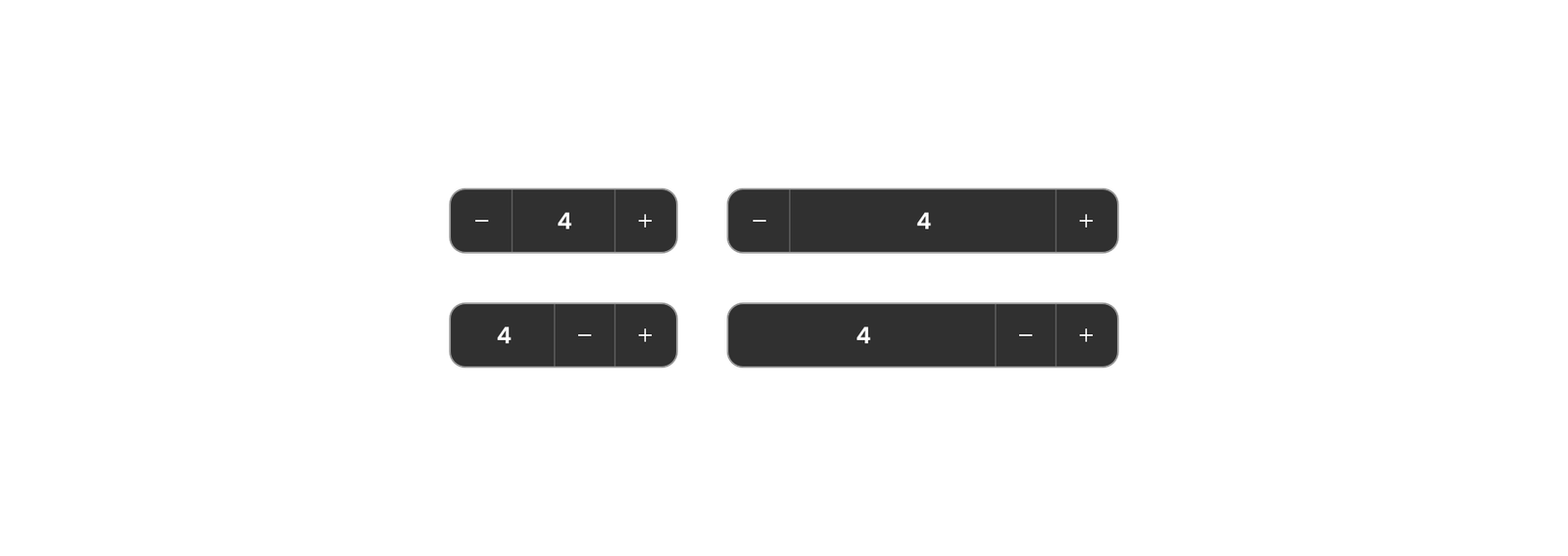
Number input
Number input lets users enter a numeric value and incrementally increase or decrease the value with a two-segment control.

Pagination
Pagination is used for splitting up content or data into several pages, with a control for navigating to the next or previous page.

Progress indicator
A progress indicator is a visual representation of a user’s progress through a set of steps, guiding toward the completion of a specified process.

Radio button
Use radio buttons when you have a group of mutually exclusive choices and only one selection from the group is allowed.

Search
Search enables users to specify a word or a phrase to find relevant pieces of content without the use of navigation.

Select
The select component allows users to choose one option from a list. It is used in forms for users to submit data.

Slider
Sliders provide a visual indication of adjustable content, where the user can increase or decrease the value by moving the handle along a horizontal track.

Tabs
Tabs are used to organize related content. They allow the user to navigate between groups of information that appear within the same context.

Tag
Use tags to label, categorize, or organize items using keywords that describe them.

Textarea
Text inputs enable users to enter free-form text data. You can use them for long and short-form entries.

Text input
Text inputs enable users to enter free-form text data. You can use them for long and short-form entries.

Toggle
A toggle is used to quickly switch between two possible states. They are commonly used for “on/off” switches.


